| Red Hat Enterprise Linux 3: Installation Guide for x86, Itanium™, AMD64, and Intel® Extended Memory 64 Technology (Intel® EM64T) | ||
|---|---|---|
| Prev | Chapter 4. Installing Red Hat Enterprise Linux | Next |
4.2. The Text Mode Installation Program User Interface
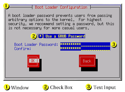
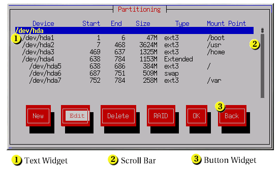
The Red Hat Enterprise Linux text mode installation program uses a screen-based interface that includes most of the on-screen widgets commonly found on graphical user interfaces. Figure 4-1, and Figure 4-2, illustrate the screens that appear during the installation process.
 | Note |
|---|---|
While text mode installations are not explicitly documented, those using the text mode installation program can easily follow the GUI installation instructions and obtain all needed information. |
Here is a list of the most important widgets shown in Figure 4-1 and Figure 4-2:
Window — Windows (usually referred to as dialogs in this manual) appear on your screen throughout the installation process. At times, one window may overlay another; in these cases, you can only interact with the window on top. When you are finished in that window, it disappears, allowing you to continue working in the window underneath.
Checkbox — Checkboxes allow you to select or deselect a feature. The box displays either an asterisk (selected) or a space (unselected). When the cursor is within a checkbox, press
[Space] to select or deselect a feature.Text Input — Text input lines are regions where you can enter information required by the installation program. When the cursor rests on a text input line, you may enter and/or edit information on that line.
Text Widget — Text widgets are regions of the screen for the display of text. At times, text widgets may also contain other widgets, such as checkboxes. If a text widget contains more information than can be displayed in the space reserved for it, a scroll bar appears; if you position the cursor within the text widget, you can then use the
[Up] and[Down] arrow keys to scroll through all the information available. Your current position is shown on the scroll bar by a # character, which moves up and down the scroll bar as you scroll.Scroll Bar — Scroll bars appear on the side or bottom of a window to control which part of a list or document is currently in the window's frame. The scroll bar makes it easy to move to any part of a file.
Button Widget — Button widgets are the primary method of interacting with the installation program. You progress through the windows of the installation program by navigating these buttons, using the
[Tab] and[Enter] keys. Buttons can be selected when they are highlighted.Cursor — Although not a widget, the cursor is used to select (and interact) with a particular widget. As the cursor is moved from widget to widget, it may cause the widget to change color, or the cursor itself may only appear positioned in or next to the widget. In Figure 4-1, the cursor is positioned on the OK button. Figure 4-2, shows the cursor on the Edit button.
4.2.1. Using the Keyboard to Navigate
Navigation through the installation dialogs is performed through a
simple set of keystrokes. To move the cursor, use the
To "press" a button, position the cursor over the button (using
Pressing
 | Caution |
|---|---|
Unless a dialog box is waiting for your input, do not press any keys during the installation process (doing so may result in unpredictable behavior). |

